How to design an authentic Western-style festival without resorting to tired tropes and stereotypes.
Every country music festival and Western-themed event wants to evoke that iconic “Wild West” vibe – wide open plains, rugged charm, and a sense of heritage. But achieving a Western look without descending into costume-party clichés takes thought and respect. Festival producers around the world have learned that authenticity resonates far more with audiences than cheap novelty. This article provides actionable advice on crafting a Western-inspired festival aesthetic that feels genuine, from branding and signage to artist collaborations.
Collaborate with Designers from the Culture
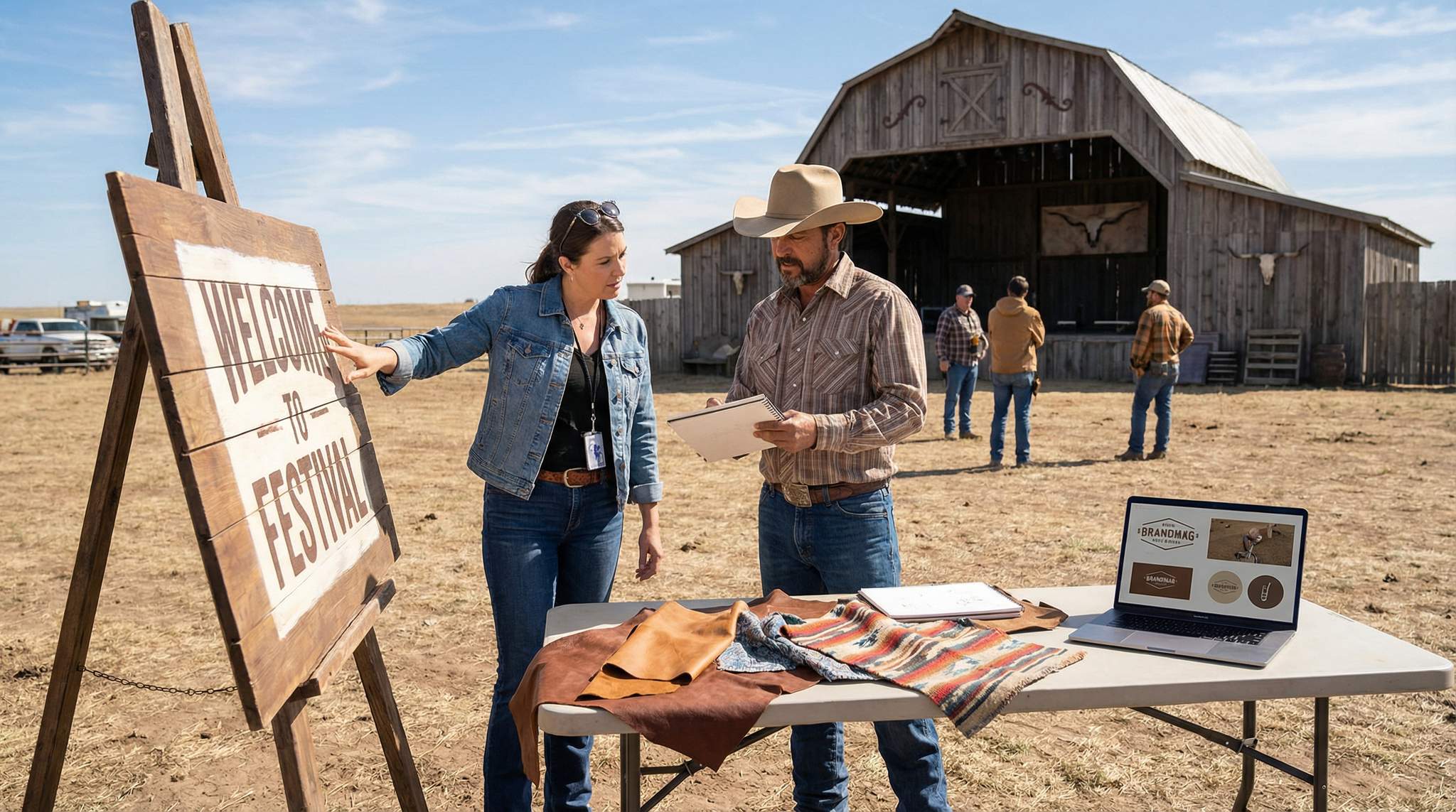
The first step to an authentic Western festival look is involving people who truly live that culture. Festival organizers should commission designers and artists from the relevant culture or region to shape the festival’s visual identity. They bring lived experience and nuanced design elements that outsiders might overlook. For example, a country music festival in Texas might partner with a local artist who understands Texan cowboy iconography beyond the usual clichés. In Canada, the Calgary Stampede (a massive rodeo and music festival) selects a young local artist each year to create its official poster art – ensuring the imagery comes from someone deeply rooted in the Western tradition of that community. By working with cultural insiders, festival organizers avoid the pitfall of “cowboy costume” visuals that feel inauthentic. Instead, the result is symbols, patterns, and art that carry real meaning for the audience.
When collaborating with local designers, festival organizers should listen to their insights on what motifs are respectful and resonant. They may suggest traditional patterns, historical references, or color palettes that honor the region’s heritage. For instance, Native American designers can advise on appropriate use of Indigenous motifs if the event touches on Native themes, or Mexican designers can guide a charreada (rodeo) festival’s look in Mexico. This not only prevents cultural appropriation mishaps, but it also signals to attendees (and the community) that the festival organizers value authenticity. The audience can sense when the visuals have depth – it reads as genuine care rather than a shallow marketing ploy.
Boost Revenue With Smart Upsells
Sell merchandise, VIP upgrades, parking passes, and add-ons during checkout and via post-purchase emails. Increase average order value by up to 220%.
Build a Flexible Visual Identity System
An impactful festival design isn’t just one pretty poster – it’s a whole system of visuals that works across all applications, big and small. Develop a flexible design system including typography, color schemes, textures, and graphic elements that can easily scale from a tiny social media icon to a massive stage banner. Consistency is key: attendees should instantly recognize the festival’s branding whether they’re looking at a flyer, a website, merchandise, or a directional sign on-site.
Start by choosing a typeface (or a pair of fonts) that reflects the Western theme but remains highly readable. It’s tempting to use overly decorative “Wild West” fonts with elaborate serifs or rope designs; however, make sure any thematic font is still legible, especially at a distance. Often, festival designers pair an ornate display font (used sparingly for titles or the logo) with a clean, simple font for body text and information. This approach captures the Western feel without sacrificing clarity.
Planning a Festival?
Ticket Fairy's festival ticketing platform handles multi-day passes, RFID wristbands, and complex festival operations.
Next, define a color palette that evokes the Western landscape or culture of the festival. Think beyond the obvious brown and red bandana patterns – consider the natural hues of the locale. A festival in the Australian outback might use sunbaked oranges and earthy ochres, while one in the American Southwest could incorporate desert sunset pinks, cactus greens, and turquoise (a color with deep Southwestern and Native significance). Use colors in a consistent way on all materials, and ensure they contrast well enough to be easily seen in bright outdoor settings.
Incorporating textures and materials imagery can also strengthen the Western vibe. For example, design assets might include motifs of weathered wood, leather grain, denim, or woven textiles native to the region. These can be subtle background elements in posters or on stage screens. The key is to apply them tastefully and not overload every single item with all the Western motifs at once. A flexible system might use a bandana pattern border on the festival poster, but for stage scrims it uses a simpler version of the logo on a solid color – carrying the brand through without visual clutter.
Crucially, ensure this visual system works for wayfinding and signage as well as it does for marketing. The design elements should adapt to things like stage lineup schedules, entrance gateways, food stall signs, and merchandise booths. If the festival uses bilingual or multilingual signage (common in many countries), typography choices need to accommodate those languages too. A well-designed icon set (for restrooms, first aid, camping, etc.) that matches the style can be invaluable. By building a robust yet adaptable design framework, a cohesive Western theme can be maintained across the entire festival experience.
Test and Refine for Sun, Dust, and Distance
Designing for a Western-themed festival often means designing for the great outdoors. Whether it’s a country music festival on a California desert polo field, a folk festival on the Australian plains, or a rodeo concert in rural Mexico, chances are there will be bright sun, dust, and long viewing distances to contend with. That’s why it’s essential to test the legibility and durability of your designs in real-world conditions.
The team should print out samples of the festival’s posters, signage, and banners and take them outside. How do the colors hold up under a blazing afternoon sun? Harsh sunlight can wash out pale colors, so the team may need to adjust the palette for higher contrast. A light tan background that looked great on a computer screen might appear nearly white in direct sun. Consider using slightly more saturated or deeper hues for outdoor-visible materials. Also, check that text stands out strongly against its background; a classic black-on-light or white-on-dark scheme often works best for glare-heavy environments.
Distance matters as well. Large outdoor festival sites mean signs must be readable from far away. A rule of thumb is to use large, bold lettering and avoid fine details on critical informational signs. For example, the schedule poster by the main stage should have big, high-contrast text for set times – not an ornate cursive font. Attendees shouldn’t have to squint or walk up close to understand a sign. As one expert signage guide advises, use clear, bold fonts and avoid overly complicated typefaces that are hard to read from a distance. Save the fancy flourishes for branding in places where people can appreciate them up close, like on merchandise or VIP badges.
Need Festival Funding?
Get the capital you need to book headliners, secure venues, and scale your festival production.
Dust and weather are another challenge typical of Western festival settings – think of the dust clouds kicked up by dancing boots at an outback concert or the sudden rain at an open prairie venue. Design all physical materials to be weather-resistant. Use sturdy, outdoor-rated materials and printing techniques. For instance, consider printing directional signs on Dibond (an aluminum composite) or heavy-duty PVC boards that won’t wilt or tear if the wind blows dust or if they get a little damp, as recommended in guides to durable festival signage. If the festival takes place in a particularly dusty locale, avoid white and light surfaces where every speck will show; a slightly textured or patterned background can camouflage dust buildup. Also plan for how signs will be mounted – a beautiful banner isn’t effective if it’s sagging or flapping in the wind. Secure installations at a good height, so even if the ground becomes muddy or dusty, the signage remains visible and clean.
Finally, the team should do a site walk-through before the festival opens. Check signage visibility at different times of day (morning sun versus twilight) and from various attendee perspectives. Is the wayfinding clear from a distance? Are stage names easily identifiable from across the field? The organizers might discover that the lovely sepia tone chosen for authenticity doesn’t stand out enough on a sun-bleached afternoon, prompting a last-minute tweak. It’s better to adjust before thousands arrive. By rigorously testing and refining, the team ensures that the carefully crafted Western aesthetic also functions flawlessly when and where it really counts.
Credit and Fairly Compensate Your Artists
Behind every great festival look is a talented designer or team of artists. Just as authenticity is valued in the visuals, that respect should extend to the creators themselves. Always credit the artists and designers who contribute to the festival’s design, and make sure they are paid fairly for their work. It might seem obvious, but in the rush of festival planning, design can be treated as an afterthought – or worse, organizers might be tempted to pull graphics from the internet or use generic templates to save money. This is a mistake: not only can it lead to legal issues, it also undermines the authenticity the event is striving for.
When a festival commissions a local artist or a specialist designer, highlight their contribution in festival marketing. For example, if a renowned Navajo artist created the poster art for a New Mexico country festival, mention that in press releases and on social media (with the artist’s permission). Attendees often appreciate knowing the story behind the artwork; it creates a deeper connection to the event. Some festivals showcase their poster or logo artist on their website with a short bio, which not only gives credit but also reinforces that the event is proud of its authentic collaborations.
Grow Your Social Following With Every Sale
Require social media follows, shares, or playlist adds to unlock presale access or special pricing. Turn every ticket purchase into audience growth.
Fair compensation is equally important. Pay creative partners a reasonable fee that reflects the value of their talent and effort. If the budget is tight, consider scaling back on less critical expenses rather than underpaying (or overworking) the design team. Remember that authenticity isn’t just about visuals, it’s about relationships. A festival that respects its artists enough to pay them fairly and honor their work is likely to cultivate long-term partnerships. Those artists will then pour even more heart into the project, and their enthusiasm will shine through in the final product.
Avoid practices like unpaid “design contests” for the festival logo or poster, which ask designers to work on spec for free. Not only can this yield generic, low-quality results, it may also alienate professional designers and local art communities. Instead, invest in one or a few trusted creatives who the organizers can work closely with. When artists feel respected, they’ll help sidestep clichés and push the design into truly original territory. In return, the festival benefits from a unique identity that can’t be bought off a stock website.
Authenticity Reads as Care
In the end, authenticity in festival design comes down to care. It shows that the festival producers cared enough to do things right – to honor the culture they’re celebrating, to invest in quality, and to sweat the details. Whether a country music festival is in Nashville, London, or New Delhi, fans will notice the difference between a cookie-cutter “Wild West” facade and a lovingly crafted Western aesthetic. Authentic design choices communicate respect: respect for the culture, for the attendees, and for the artistry that brings the festival to life.
When a festival’s visuals feel real and rooted, attendees respond. They’re more likely to trust the organizers and embrace the event’s theme. It can even boost marketing, as genuine and striking designs get shared on social media and talked about in the community (“Did you see that beautiful poster? It really captures our hometown spirit!”). On the flip side, a sloppy or stereotypical design might get laughs or criticism and signal that the event itself could be similarly superficial.
Remember that authenticity is an experience, not just a look. It’s supported by all the choices made – the venue, the lineup, the food vendors, and yes, the design and décor. By commissioning cultural experts, building a flexible and functional visual identity, rigorously testing signage in real conditions, and treating artists with respect, the result is an environment of authenticity. And that doesn’t go unnoticed. Attendees might not consciously list all these factors, but they’ll feel it. They’ll feel that the festival was crafted with care, and that feeling turns a good event into a great, memorable one.
Frequently Asked Questions
How can country music festivals avoid Western design clichés?
Festival organizers can avoid clichés by collaborating with designers and artists from the specific culture or region. These insiders bring lived experience and nuanced elements, such as traditional patterns or historical references, rather than relying on tired tropes like generic cowboy costumes. This approach ensures symbols and art carry real meaning for the audience.
What are the best color palettes for Western-themed festival branding?
Authentic Western color palettes should reflect the natural hues of the specific locale rather than generic red and brown. For example, festivals in the American Southwest might use desert sunset pinks, cactus greens, and turquoise, while Australian events could utilize sunbaked oranges and earthy ochres. High contrast is essential for outdoor visibility.
Which fonts work best for Western festival signage?
Effective Western festival typography often pairs an ornate display font for titles with a clean, simple font for body text. While decorative fonts establish a theme, legibility is paramount. Organizers should use large, bold lettering for informational signs to ensure attendees can read schedules and directions from a distance without squinting.
How should festival signage be designed for outdoor weather conditions?
Outdoor festival signage must be printed on weather-resistant materials like Dibond or heavy-duty PVC to withstand wind, rain, and dust. Designers should test colors in direct sunlight, often opting for higher contrast or deeper hues to prevent washing out. Secure mounting is also critical to keep signs visible in windy environments.
Why is it important to hire local artists for festival design?
Hiring local artists ensures the festival’s visual identity is rooted in genuine cultural tradition rather than superficial stereotypes. Beyond authenticity, fair compensation and public credit for these creators foster long-term partnerships and community trust. This approach avoids the pitfalls of generic stock imagery and signals respect for the culture being celebrated.
How does distance affect outdoor festival signage design?
Large outdoor venues require signs with large, bold lettering and minimal fine details to remain readable from far away. High-contrast color schemes, such as black-on-light or white-on-dark, help text stand out against complex backgrounds. Designers must ensure critical information like stage schedules can be understood without attendees needing to walk up close.