Building a memorable festival brand is about creating authentic visual experiences that resonate with attendees. One rising trend is a handcrafted aesthetic – using elements that feel human-made, artisanal, and intimately crafted. However, a beautiful craft-inspired design must never come at the cost of clarity. This article explores how festival producers can develop a visual identity that nods to craft through type, texture, and colour without hurting readability. From sunlit fields to rainy evenings, from posters on city walls to stages across a farm, this guide covers how to test and refine your designs. Learn how commissioning local illustrators, maintaining consistency across all materials, and signalling authenticity (not clip art) can elevate a festival’s brand.
By the end, you’ll have a mentor-tested roadmap to build a festival visual system that feels handcrafted and welcoming while staying modern, clear, and legible.
The Charm of a Handcrafted Festival Identity
In an age of polished digital graphics, a handcrafted festival identity stands out. It signals authenticity and personal touch, suggesting that real human hands (and hearts) shaped the experience. Festival-goers often cherish events that feel rooted in local culture or artisanal craft. Whether it’s a boutique music weekend in a rural English village or a food and art festival in Melbourne, an authentic look helps attendees connect emotionally with the event.
Why go handcrafted? For one, it differentiates a festival from generic corporate events. Hand-drawn logos, textured backgrounds, or illustrations inspired by local art traditions can make the branding instantly recognisable. For example, a folk festival in Canada might incorporate fiddlehead fern motifs and rustic wood textures to evoke a homey, folk-art feel. A craft beer festival in Germany could use vintage letterpress-style typography reminiscent of old brewery signs. These touches create a sense of place and community. Attendees see the care in the design and feel that the festival has character and soul.
Boost Revenue With Smart Upsells
Sell merchandise, VIP upgrades, parking passes, and add-ons during checkout and via post-purchase emails. Increase average order value by up to 220%.
However, embracing craft aesthetics doesn’t mean abandoning modern design principles. On the contrary, the most successful festival brands marry the warmth of handmade elements with the professionalism of clean, readable design. Striking this balance is key – and entirely achievable with careful planning and testing.
Balancing Artistry and Legibility
A common mistake is leaning too far into decorative design and jeopardising readability. The first rule for any festival producer is: information must be easy to read at a glance. Your beautiful artisanal typography and rich colours won’t mean much if attendees can’t find the entrance, read the schedule, or identify which recycling bin is which. Legibility is a safety issue as well as a design concern – clear signs help with crowd flow and emergency information.
Planning a Festival?
Ticket Fairy's festival ticketing platform handles multi-day passes, RFID wristbands, and complex festival operations.
Typography choices: Select fonts that convey your festival’s personality but remain easily readable. A popular strategy is to pair one decorative typeface with one simple, high-legibility typeface. For instance, you might use a hand-drawn or cursive font for the festival name or stage names (to give a crafty, unique flair) but use a clean sans-serif or clear serif font for body text and directional signs. This way, you get the best of both worlds: craft-inspired headlines and modern legible details. Avoid overly elaborate cursive or illegible display fonts for any text that people need to read quickly (like “Toilets” or “Emergency Exit”). If you’re unsure, step back and apply the squint test – if you squint and the words become indistinguishable, the font is likely too fussy or thin.
Contrast and colour: Handmade aesthetics often involve earthy or vintage colour palettes – think muted tones, faded inks, or textured backgrounds. These can look fantastic, but always maintain sufficient contrast between text and background. A textured parchment-like poster background might fit your rustic theme, but ensure that black or dark text sits on it boldly (or use a light text on a dark overlay). Similarly, if you use multi-coloured tie-dye patterns or vibrant local art, reserve plain, contrasting panels where text will go. High contrast is crucial for readability in varied lighting. Many festival producers use accessible design guidelines (like ensuring around 70% contrast difference between text and background colours) to guide these choices. This not only helps general legibility but also assists those with visual impairments to enjoy the festival without frustration.
Simplicity where it counts: Embrace white space and simple layouts for informational content. Your overall aesthetic can be rich and handcrafted, but each individual sign or graphic should communicate a clear message. An ornate border or rough paper texture can frame a message nicely – as long as the text in the middle is straightforward. Icons and illustrations should be intuitive if they’re conveying info (e.g., a hand-drawn water droplet icon for a water refill station is great – but ensure it’s still recognisable as a water source symbol). Always ask, “Will a first-time attendee from another country understand this sign in a couple of seconds?” If yes, you’re on the right track.
Testing Designs in Real Conditions: Sun, Rain, and Distance
Even the most beautiful poster design on a computer screen can fail in the wild. Festivals take place in unpredictable environments – bright sun, pouring rain, day and night, cramped indoor halls and sprawling outdoor fields. It’s essential to test your visual materials in conditions that mimic the festival.
Go Cashless With RFID Technology
Enable contactless payments, faster entry, and real-time spending analytics with RFID wristbands and NFC-enabled ticketing for your events.
-
Sunlight and glare: Print out your posters, signage, and even stage screen graphics and examine them under direct sunlight. What looks good on a backlit screen might wash out in harsh noon sun. Light colours can appear even lighter and low-contrast details may disappear. For example, a dainty light-orange lettering that was visible on your laptop might be illegible under a bright summer sky. To combat this, test different materials (matte vs. glossy finishes) and consider outlining important text or using shadows underneath text to improve definition. Some festivals in sunny climates (like those in Australia or Spain) learned this the hard way – they had to reprint directional signs on-site because the original pale inks became unreadable when the sun was high. A simple test beforehand can save you a costly reprint and confusion on the day.
-
Rain and weather: If your aesthetic includes watercolour effects, paper textures, or actual hand-painted signs, think about rain. Will your signs run or smudge if wet? It’s wise to weatherproof critical signage. Laminate paper signs, use waterproof inks, or have acrylic shields for delicate posters. Also consider how things look when wet: a dark poster can become glossy with rain, reflecting lights and becoming hard to read. If you can, simulate rain by spraying a light mist of water on a test print, and see if it’s still legible under outdoor lighting. Festivals in tropical climates (like those in Singapore or India during monsoon season) often use vinyl banners or coated boards even if they mimic a handmade look, ensuring the visuals survive sudden downpours. Your design should survive both an unexpected rain shower and a muddy field.
Need Festival Funding?
Get the capital you need to book headliners, secure venues, and scale your festival production.
-
Distance and scale: What good is a beautifully crafted sign if only those a metre away can read it? Always evaluate your designs from far away. A rule of thumb many event organisers use is to stand back at least 10 metres (30 feet) from a sign and see if you can still comfortably read it. Test your largest stage banners from across the venue field, and test smaller directional signs from the other end of a walkway. You may discover that the lovely thin script font you chose for stage names looks like an indistinct line from afar – that’s a cue to swap it for something bolder. In downtown settings (say, for an urban art festival in Amsterdam or Singapore), print posters at real size and tape them to a wall; walk down the street and see if the key info (festival name, date, call-to-action) stands out among other city posters. If not, amplify it – bigger text, higher contrast. Attendees typically spend only a moment glancing at signage or a poster, especially if they’re moving in a crowd. Make that glance count by maximising clarity at a distance.
Real-world testing should extend to digital screens too. If your festival uses LED screens for schedules or art displays, check their visibility in daylight and at night. Some colours that look fine on print might bloom or blur on LED. By testing early and often, you catch pitfalls before they impact the attendee experience.
Commission Local Illustrators for Authenticity
One of the most powerful ways to achieve a handcrafted yet professional identity is to work with local artists. Commissioning a local illustrator or graphic artist injects genuine character into your festival brand. It supports the local creative community and often yields designs that reflect the regional culture or festival theme in a deeper way than any generic template could.
Local flavour: A festival’s visuals can pay homage to its location. For example, a boutique festival in Mexico might collaborate with an artist skilled in papel picado-style illustrations (the intricate paper cut designs popular in Mexican fiestas) to create patterns or icons unique to the event. In New Zealand, a festival might incorporate M?ori motifs by commissioning indigenous artists, giving the branding a sense of place and respect for local culture. By hiring local talent, you ensure that the design language resonates with the community and feels less like a cookie-cutter template used elsewhere.
Originality and uniqueness: When an illustrator creates custom artwork for your festival – be it a mascot character, a scenic poster, or hand-drawn stage icons – it differentiates your branding. Attendees notice these unique touches. Many music and arts festivals around the world release new poster art each year specifically to excite collectors and fans. A great example is the Montreux Jazz Festival in Switzerland, which for decades has commissioned famous and local artists to design its annual posters, turning them into coveted art pieces. Similarly, the Edinburgh Festival Fringe often uses bold illustrations and unconventional typography that reflect its eclectic, creative spirit. These aren’t off-the-shelf graphics; they’re bespoke artworks that make the festival’s identity memorable year after year.
Give credit and build community: Always credit your artists prominently. Include their signature on posters, mention them in social media posts, feature them on your website and even in the festival programme. This not only is the right thing to do, but it also humanises your brand – festival-goers appreciate knowing there’s an actual artist behind the visuals. It tells a story of collaboration and values. When people see a beautiful mural at your event or a quirky logo on your merchandise, and then learn it was done by a local art student or a collective, it creates goodwill and talking points. Plus, the artists themselves become ambassadors for your festival, proudly sharing their work and thereby promoting the event to their networks.
Budgeting for commissioned art is an investment in authenticity. Even if funds are tight, consider smaller scope collaborations: maybe a local illustrator just creates a few key elements (like a border design or a set of icons) that you can incorporate into the wider design. You get the benefit of that handcrafted look, and the artist gets exposure and work. Festivals in places from Indonesia to Canada have forged strong identities by weaving local art into their brand fabric. It’s a win-win that yields a rich, handcrafted identity you simply can’t download from a stock website.
Consistency Across Every Touchpoint
A handcrafted identity with modern legibility should extend across all festival touchpoints – from the moment someone sees an ad or ticket, to when they enter the grounds with a wristband, to the merchandise they take home. Consistency is what makes all these pieces feel like part of one cohesive experience. Without it, even well-designed elements can feel disjointed.
Print and digital materials: Ensure your festival’s website, social media graphics, and email newsletters carry the same craft-inspired aesthetic as your physical signage and posters. If your poster uses a particular illustrated character or motif, that element can appear on your Facebook event banner, your mobile app design, or your TikTok videos. Use the same colour palette and fonts online and offline (with web-friendly equivalents if needed). This unified visual presence reinforces brand recall – people see a post on Instagram and immediately connect it to the flyer they saw in a café. Consistency also signals professionalism; it shows that the festival organiser has an eye on every detail.
Wristbands, badges, and tickets: Often overlooked, these small items are actually a prime canvas to reinforce your handcrafted brand feel. A festival wristband isn’t just a security pass – it’s a souvenir and a constant brand touchpoint worn by attendees all weekend (and sometimes kept for months or years after). Use your brand colours, maybe a pattern or texture from your poster art, and clear festival name text on these bands. Many festivals now print high-quality fabric wristbands that allow for colourful designs rather than single-colour plastic strips. If your festival has tiered passes or special access areas, you can differentiate wristbands by colour or icon, but keep the overall style consistent. The same goes for artist or crew badges – a little artwork or thematic design on a readable badge makes even your staff feel part of the branded experience.
Tickets (physical or digital) and QR codes can also carry the visual identity. If using a ticketing platform (like Ticket Fairy’s platform, which supports custom branding), upload your logo and brand colours so that e-tickets and event pages feel like an extension of your festival. These touches comfort ticket buyers that they’re in the right place and build excitement with consistent visuals from purchase to attendance.
On-site signage and screens: Once attendees arrive, every sign should look like it belongs. Directional arrows, schedule boards, stage banners, food stall signs, even the menu boards at a coffee truck – try to apply your design system to all of them. This doesn’t mean every sign must be overly decorative (remember legibility!), but they can share elements. For example, use the same font for all headlines on signs, the same colour scheme for backgrounds or borders, or a small logo/mascot icon on each sign to tie them together. If you created a custom icon set (perhaps a little hand-sketched beer mug for the beer tent, a music note for the open mic stage, etc.), use them universally so people learn the symbols. Consistent branding across the site makes navigation easier because people subconsciously know what to look for – e.g., they realise all official info signs are on green wooden boards with white painted letters, as opposed to random pieces of paper.
Merchandise is another extension: T-shirts, tote bags, caps, and festival programmes should all sing the same tune visually. If you’ve commissioned a beautiful illustration for your festival, consider printing it on your merch – attendees then become walking ambassadors wearing your festival’s art. Just be sure any text on merch (like festival name or tour dates on a shirt) follows the clear, readable font styles you’ve set. There’s a balance between a cool, artsy T-shirt and one that actually broadcasts the festival’s name legibly when someone wears it in public.
Authenticity Over Perfection: Embracing the Human Touch
At the heart of a handcrafted aesthetic is the idea that human touch matters more than slick perfection. Festival audiences, especially in the boutique and cultural scenes, respond to visuals that feel personal. Brush strokes, slightly irregular lines, or textures of fabric, paint and wood in your designs can evoke a sense of warmth and authenticity. It tells attendees that your festival isn’t just another mass-produced product, but rather a labour of love.
Avoiding the clip-art trap: Steer clear of generic graphics and stock art that countless other events might use. Nothing undermines a “handcrafted” vibe faster than a stock icon that people recognise from a hundred unrelated posters. Instead of generic clip-art of a guitar or fork (for a music or food festival), use stylised versions drawn by your team or artist. If you lack illustration resources, even simple solutions like tracing a photograph to create a minimalist outline, or using templates as a base and then customising them, can help produce something unique. Remember, authentic doesn’t always mean overly complex – it means “clearly not mass-produced.” Sometimes a bold, simple hand-drawn logo will stick in memory far better than a detailed but stock-image-based graphic.
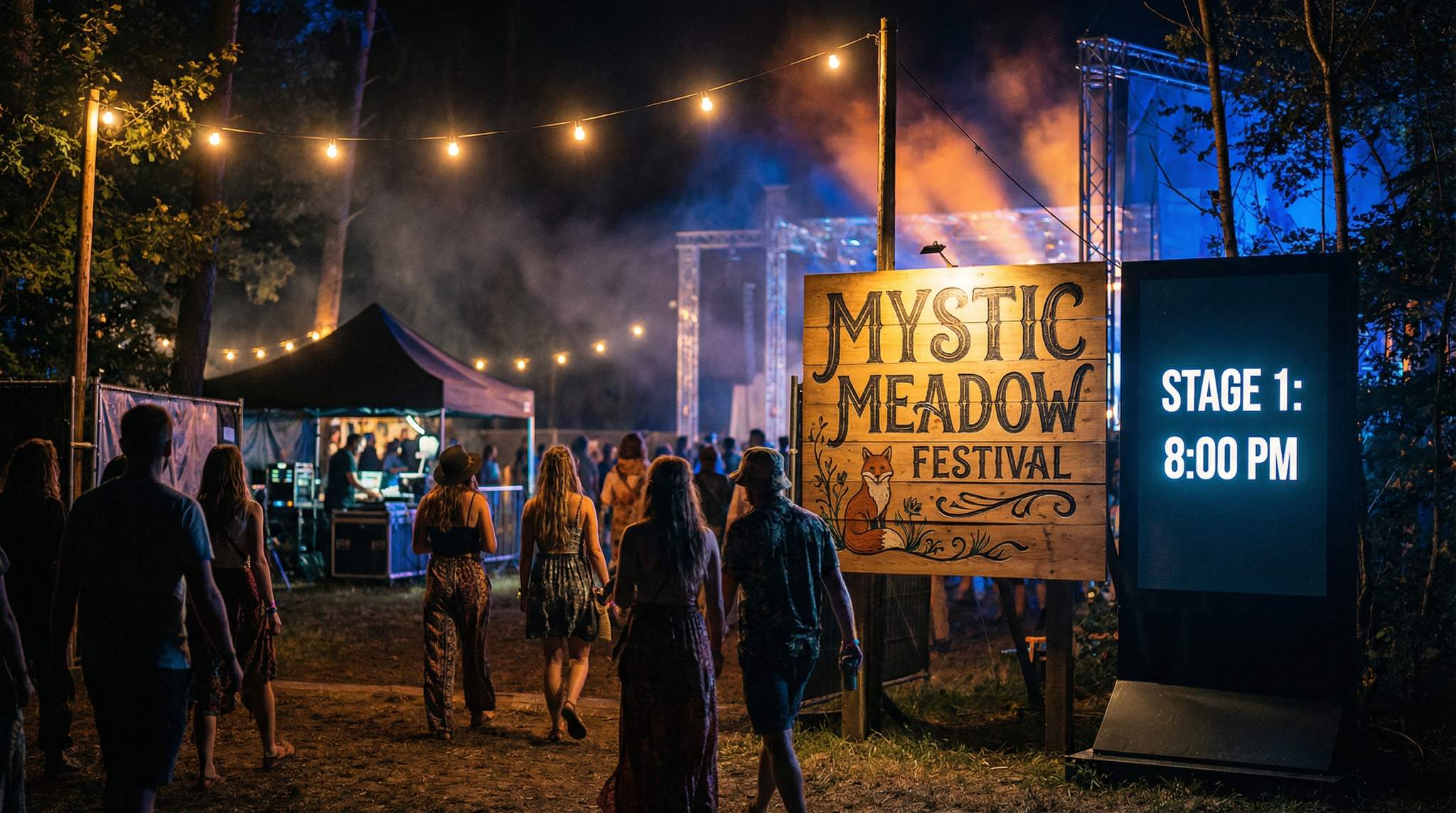
Embrace imperfections (to a point): Part of handcrafted charm is imperfection – a slight misprint effect, letters that aren’t perfectly uniform, or colour that isn’t exactly the same on every banner. These can humanise your brand. For example, the Glastonbury Festival in the UK famously employs hand-painted signs around its massive grounds. These signs, often painted by local volunteers and artists, are not machine-perfect, but they are large, vibrant, and clear enough to read. They add a quirky character to the pathways and stages, making the whole venue feel like an extension of the festival’s creative ethos. Glastonbury even operates a vintage printing press on-site (the “Glastonbury Free Press”) that produces posters and newspapers for the festival – a brilliant way to incorporate real craft into a modern event. Attendees love snapping photos of these elements because they feel the human effort behind them. The lesson here is that attendees are surprisingly forgiving of a hand-drawn letter that’s a bit wobbly, but they won’t forgive not being able to find essential information. So, allow for charm and quirks, but always double-check that each piece still communicates effectively.
Storytelling through design: Use your handcrafted visual system to tell a story. Perhaps the textures you choose (linen, woodgrain, chalk) relate to the festival’s theme or origin. If your festival started as a small gathering in a barn, a subtle wood texture or old-style print font can nod to that history. If it’s a community cultural celebration, maybe patterns inspired by local crafts (quilting, weaving, pottery paint strokes) can be woven into the visuals. When every design choice has a reason grounded in authenticity, your marketing materials become storytellers in their own right. People may not consciously pick up on every reference, but they will feel the coherence and intentionality.
And modern legibility plays a role in authenticity too. Clear communication is a sign of respect for your audience. It shows that while you love artistic flourishes, you also care that attendees of all ages and backgrounds can participate fully. The most beloved festivals in the world succeed by making everyone feel included—and good signage and readable information are absolutely part of that inclusivity.
Learn from Successes and Missteps
Even veteran festival producers have had their share of design experiments that didn’t go as planned. What’s important is learning and iterating. Here are a couple of real-world lessons from festivals that tried blending craft and clarity:
-
Case: Too Much Craft, Not Enough Clarity – A regional music festival in France once adopted a medieval fair theme for its branding. The posters and decorations featured elaborate Gothic-style calligraphy to mimic old manuscripts. While gorgeous as art, attendees struggled to decipher the festival name and details on the poster without squinting. On-site, the same fancy font on directional signs had to be replaced with printed labels by day two because people kept getting lost. The organisers learned that decorative type should be used sparingly and never for core information. After this, they kept the medieval colours and textures (and even a lovely illustrated crest as the logo) but switched to a plain, readable font for all important text. The following year, their attendance improved and feedback highlighted how much more welcoming and navigable the event felt.
-
Case: Testing Saves the Day – A large outdoor art festival in Australia designed a beautiful banner for its main stage, featuring local indigenous art and a creative cursive title. Before printing dozens of these banners, the design team did a full-size test print and hung it up on a fence outside their office. From across the street, they noticed the vibrant artwork was stunning, but the cursive letters of the stage name blended into the background at a distance. Thanks to this test, they adjusted the colour of the text to bright white (which wasn’t as stylistically subtle, but highly visible) and added a thin dark outline to the letters. They also enlarged the type by 20%. The final banners looked slightly less “delicate” up-close, but from the crowd’s perspective they popped perfectly. During the festival, attendees easily found the stage and also appreciated the beautiful artwork – a success in both form and function. This story underlines that prototyping in context (and not being precious about tweaks) can save you from unintended mistakes.
-
Case: Consistency Builds Trust – An international food festival that tours across cities (including in the US, UK, and Asia) found that consistency in branding greatly affected attendee trust and loyalty. In its early years, the festival’s look and feel changed a bit from city to city as different local teams tweaked the designs. Attendees who followed the festival from one location to another felt the experience was fragmented. Taking the lesson, the organisers developed a comprehensive brand style guide with a crafted logo, colour sets, and templates for signs and social media. They allowed slight local flavours (like a local illustrator’s artwork for each city’s poster), but the core elements remained uniform. The result was that wherever the festival went – whether Toronto, London, or Singapore – returning fans recognized it instantly and newcomers understood it as part of a reputable, well-organised series. The consistency said “this event pays attention to detail,” which is crucial for convincing someone to buy a ticket, especially in a new market. It’s a great example of how a well-managed brand aesthetic (even one that looks handmade) isn’t just art – it’s a professional asset.
Every festival is unique, and you might discover your own nuances. The key is to remain observant and adaptable. Gather feedback: Did people comment on the beautiful art but also on difficulty finding info? Or did certain signs become popular photo backdrops (a sign of success in branding nowadays)? Use those insights for the next iteration of your festival’s design.
Frequently Asked Questions
Why should boutique festivals use a handcrafted brand aesthetic?
A handcrafted festival identity signals authenticity and a personal touch, differentiating events from generic corporate branding. By using elements like hand-drawn logos or textured backgrounds, festivals create a sense of character and soul that helps attendees connect emotionally. This approach suggests real human care shaped the experience rather than mass production.
How can festival signage balance artistic fonts with readability?
Festival producers balance artistry and legibility by pairing decorative typefaces with simple, high-legibility fonts. Use hand-drawn or cursive styles for headlines to add flair, but reserve clean sans-serif or serif fonts for essential body text and directional signs. This ensures the aesthetic remains unique while critical information stays readable at a glance.
What are the best practices for testing festival signage outdoors?
Organizers should test signage by printing designs and examining them under direct sunlight to check for glare and color washout. To simulate weather, spray a light mist of water on prints to ensure ink stability. Additionally, view signs from at least 10 meters away to verify that text remains legible from a distance.
Why is commissioning local illustrators important for festival branding?
Commissioning local illustrators injects genuine character into festival branding and supports the regional creative community. Custom artwork, such as mascots or scenic posters, reflects local culture and differentiates the event from cookie-cutter templates. This collaboration creates a unique visual language that resonates deeply with attendees and avoids generic stock imagery.
How can festivals maintain brand consistency across different touchpoints?
Festivals maintain consistency by applying the same visual system—including color palettes, fonts, and motifs—across all physical and digital touchpoints. From websites and social media to wristbands, tickets, and on-site signage, every element should reflect the core aesthetic. This unified presence reinforces brand recall and signals professional attention to detail.
What contrast standards should festival designers follow for accessibility?
Effective festival design requires high contrast between text and background colors to ensure readability in varied lighting conditions. Designers should aim for approximately 70% contrast difference, such as dark text on light textured backgrounds or vice versa. This practice improves general legibility and ensures accessibility for attendees with visual impairments.