Crafting a brand identity for a food festival goes beyond choosing vibrant colors and decorative logos. At a food festival – whether it’s a local street food fair in Mexico City or a gourmet wine and cheese weekend in France – the visual identity must serve a purpose. Guests are there to eat and explore, so the festival’s name, logo, and overall design should help guide hungry attendees through their culinary journey. An effective menu-first visual identity means every visual element is designed to help guests make choices about what to eat, not just to decorate the venue. From a catchy festival name that sets expectations, to a logo that captures the theme, to menu boards and signage readable under steam and sun, a well-thought-out brand system enhances the entire food festival experience.
Choosing the Perfect Festival Name
Naming a food festival is the first big branding decision – it’s how the world will refer to the event. A great name needs to be memorable, descriptive, and appealing across different cultures and languages. Here are some considerations for festival naming:
- Relevance and Clarity: The name should hint at the festival’s culinary theme or region. For example, Taste of Singapore immediately tells attendees it’s about sampling Singaporean cuisine. BBQ & Blues Fest suggests a barbecue food theme paired with music. A clear, relevant name sets the right expectations.
- Memorability: Short, catchy names or inventive phrases stick in people’s minds. Alliteration or puns can work well if they’re easy to understand (e.g., Feast in the East, Bite of Bangkok). Avoid overly long or complicated names that attendees might forget or mix up.
- Uniqueness: Research other events globally to ensure the name isn’t already in use. An original name helps avoid trademark issues and confusion. A festival producer in New Zealand or Canada might discover that a planned name is taken by an event abroad – always double-check domain availability and social media handles before committing.
- Cultural Sensitivity: Since food festivals often celebrate culture, make sure the name is respectful and appealing in the local context and any languages used. For international festivals, consider how the name translates or whether it might carry unintended meanings in another language.
- Future Growth: Envision the festival’s potential growth. A name like “Local Veggie Fair” might work for a small community event but could feel limiting if the festival later attracts international chefs or expands its scope. Ensure the name can grow with the festival’s ambition.
Beyond the main event title, producers must also consider how individual vendors present themselves. Curating food festival stall names is a subtle but impactful part of the overall brand experience. When reviewing vendor applications, organizers should encourage clear, appetizing stall titles that complement the broader festival theme. If a vendor’s standard business name is too generic, suggesting a specialized pop-up moniker for the weekend can help them attract more foot traffic while keeping the event’s culinary narrative cohesive.
When brainstorming names for a food festival, organizers should also consider their target demographic and the event’s scale. For instance, college cultural fest names often blend youthful energy with culinary traditions, using catchy, modern phrasing that appeals to students. Additionally, if you are targeting an international tourist crowd or hosting an event in a non-English speaking region, incorporating food fest names in English alongside the local language can significantly boost your event’s discoverability and appeal to a broader audience.
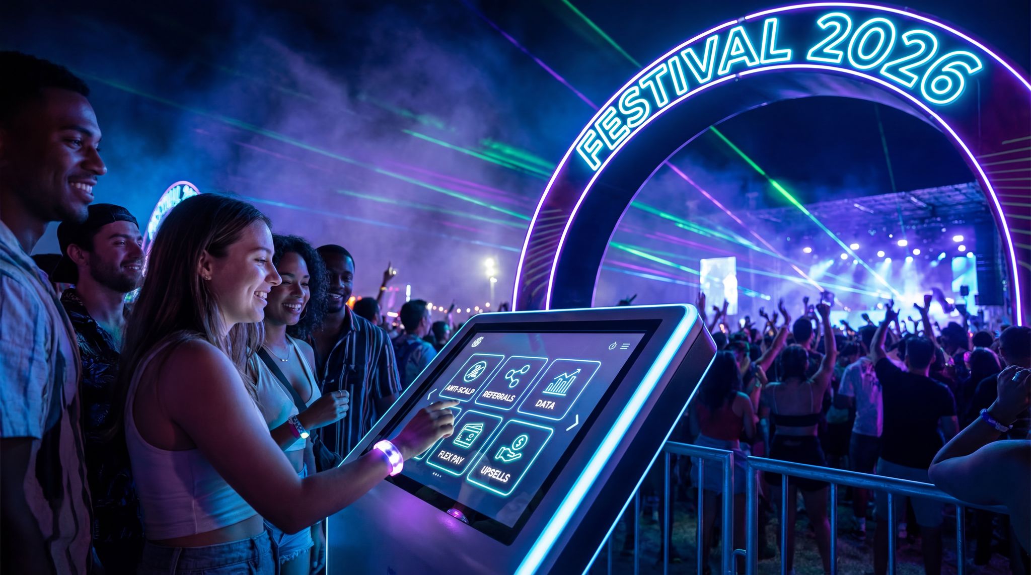
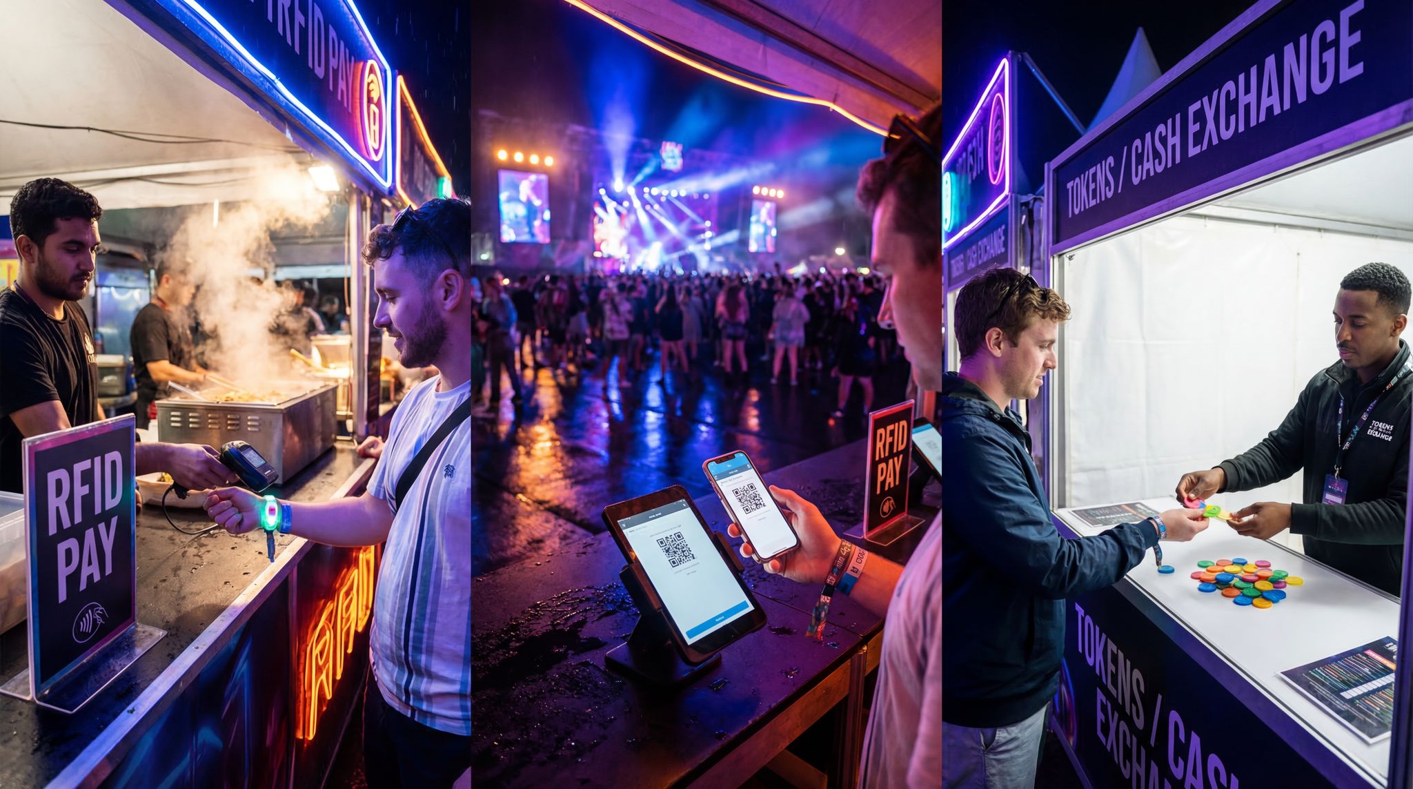
Go Cashless With RFID Technology
Enable contactless payments, faster entry, and real-time spending analytics with RFID wristbands and NFC-enabled ticketing for your events.
Crafting a Logo that Resonates
A festival’s logo is its visual ambassador – appearing on posters, social media, tickets, merchandise, and all around the event site. Designing a logo for a food festival comes with unique challenges and opportunities:
- Reflect the Theme: The logo should instantly convey the essence of the festival. For instance, a chili pepper motif might suit a spicy food festival in India, while stylized wine glass imagery could fit a wine and food weekend in Italy. Incorporate graphics or symbols that represent the cuisine or culture at the heart of your event.
- Simplicity and Versatility: Great logos are usually simple enough to be recognized at a glance. Avoid overly intricate details that could become illegible when scaled down on a wristband or social icon. A bold, clean design – perhaps a single emblem or a clever combination of food-related symbols and text – will be versatile. Ensure it looks good in color as well as in monochrome (for instances like stamps or single-color prints).
- Readable Typography: If the festival name is part of the logo, choose a typeface that’s highly readable. Swirly or ultra-fancy fonts might fit a theme but can backfire if people can’t easily read the name. Many successful festival logos use custom lettering or clear fonts so they stand out both up close and from afar. For example, the Melbourne Food & Wine Festival uses capital letters in a straightforward, modern font which remains legible on everything from banners to wine glasses.
- Adaptable Layouts: Design variations of the logo for different uses. Have a primary full logo (with text and imagery together) and alternate versions like an icon or badge that can fit in a square or circular format. For example, Taste of London might use its full wordmark on a banner, but a fork-and-knife icon version on social media. This flexibility ensures consistent branding across all channels.
- Color Palette with Purpose: Choose colors that align with the festival’s vibe and remain visible in outdoor settings. Vibrant colors often evoke food and fun – like orange for a summer citrus fest or green for an organic farmers’ market. However, make sure the colors also contrast well for readability (e.g., dark text on a light background, or vice versa). Test the logo’s colors in sunlight to ensure they don’t wash out; a logo that pops on a computer screen should also pop on a sun-drenched banner at the festival gate.
The Menu-First Visual Identity Approach
Unlike music festivals where stage art might take center stage, food festivals revolve around what’s on the menu. Adopting a menu-first visual identity means prioritizing the design of menus, food signage, and informational graphics from the start of the branding process. In practice, this approach ensures that every aesthetic choice is also a functional one, helping attendees navigate their food choices with ease. Key elements of a menu-first visual identity include:
Planning a Festival?
Ticket Fairy's festival ticketing platform handles multi-day passes, RFID wristbands, and complex festival operations.
Comprehensive food and drink festival branding relies heavily on this menu-first philosophy. By treating the menu as the cornerstone of your visual identity, you ensure that every aesthetic choice directly supports the primary reason attendees bought a ticket: to eat and drink.
Beyond just the food stalls, effective food and drink festival branding must also encompass beverage partners, VIP tasting lounges, and bar areas. When organizers unify the visual language across both culinary and beverage experiences—such as matching custom reusable cups with the main event typography or designing cohesive token systems for craft beer tents—it elevates the entire production. This holistic approach ensures that whether a guest is ordering a gourmet slider or a signature cocktail, the brand experience remains uninterrupted.
Readable Menu Typography
The heart of any food festival is the menu – whether it’s a list of gourmet dishes, street food bites, or craft beverages. If attendees can’t read the menus quickly, they can’t decide what to eat, leading to frustration (and slower lines). Here’s how to make menu text ultra-readable:
- Large, Clear Fonts: Use typefaces that are easy on the eyes. A sans-serif or clean serif font with good spacing is ideal for menu boards. Avoid overly decorative fonts for the main menu text. As a rule of thumb, make the item names large enough to be read from a few meters away. For example, menu titles in 1-inch (2.5 cm) tall lettering can be read at roughly 10–12 feet (around 3–4 meters) distance. Consider the average distance a person will stand from the food stall and size your text accordingly.
- High Contrast: Design menu boards with text that sharply contrasts the background. Dark lettering on a light background (or white text on a dark board) is vastly more legible than a low-contrast mix of colors. For instance, black text on a matte white board remains one of the easiest combinations to read under bright sunlight. If your festival branding uses vibrant colors, integrate them as accents or borders, but keep the core text section high-contrast for clarity.
- Test Under Real Conditions: Before finalizing menu signage designs, test a printed sample under the same conditions it will face. Take it into bright sun to see if it’s still readable. If your festival features live cooking (think of a ramen or BBQ festival with steaming pots and grills), hold the sign near steam to see if moisture or fog affects visibility. You may find that using a non-glare, matte finish on signage is better than glassy laminates that could fog up or reflect too much light.
- Consistent Typography: Establish a hierarchy of font sizes and styles (e.g., item name, description, price) and use it consistently across all vendors and signs. Consistency not only looks professional but also means once a guest has read one sign, they subconsciously know where to look on the next sign for the price or dietary info because the layout is the same. Providing vendors with a branded menu template or style guide can help enforce this consistency across the festival.
Allergen & Dietary Icons
Food festivals attract diverse crowds, including people with dietary restrictions and food allergies. A thoughtful visual system accounts for this by including clear allergen and dietary icons on menus and signage:
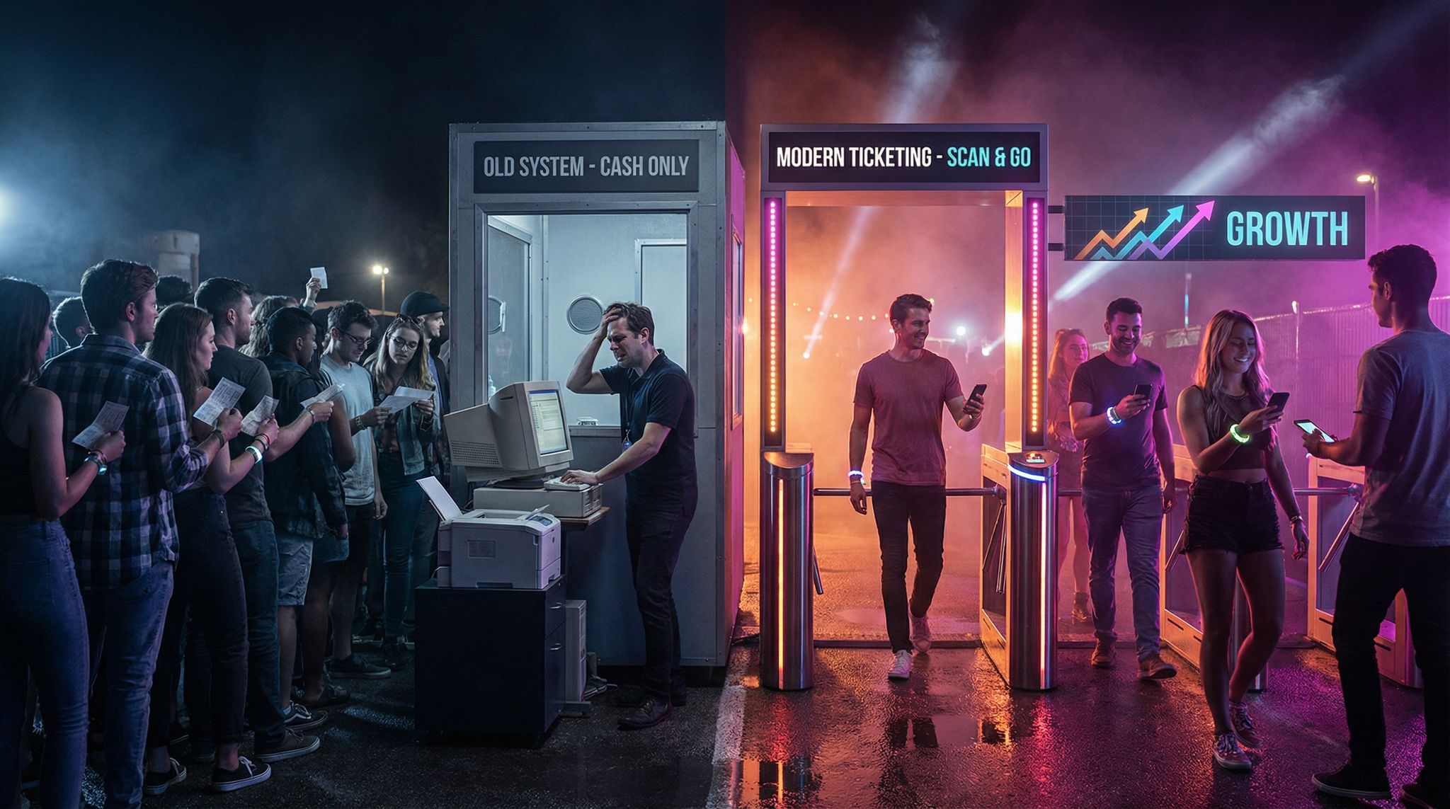
Smooth Entry With Mobile Check-In
Scan tickets and manage entry with our mobile check-in app. Supports photo ID verification, real-time capacity tracking, and multi-gate coordination.
- Universal Symbols: Use well-recognized symbols or abbreviations to denote common dietary categories. A simple leaf icon can indicate vegetarian or vegan options (some festivals use “V” for vegetarian and a separate “VE” or a vegan symbol for vegan). A wheat stalk crossed out typically signals gluten-free. A peanut icon can warn of peanut ingredients, and a small milk carton or an egg icon can denote dairy or eggs. By integrating these icons next to item names, you allow guests to scan for suitable options at a glance.
- Create a Legend: Even if icons seem self-explanatory, include a small legend on menu boards or at least in a central location (like the festival program or a large sign near the entrance listing all vendors). This ensures no guest is confused about what a symbol means. For example, a British food festival might list “GF = Gluten Free, ? = Spicy” on each vendor’s menu sign for clarity, while a festival in Indonesia might include bilingual explanations if using text abbreviations.
- Consistency Across Vendors: Standardize the icons and labels festival-wide. Instead of letting each food stall invent its own way to mark vegan dishes, provide a set of official icons or stickers. The consistency helps guests trust the labels and avoid missing details. It also looks cleaner when all signage follows the same system. Large-scale events in the US and UK often hand out an “allergen kit” to food vendors with symbols to use, aligning with local health regulations that require allergen information to be displayed.
- Highlighting Options and Warnings: Design icons to be noticeable but not overwhelming. They should complement the menu text. Use a contrasting color for icons (for instance, a bright green V for vegetarian options, or a red chili symbol to denote heat/spiciness) as long as it doesn’t clash with readability. The goal is to help guests make quick decisions (like a parent seeking nut-free foods for a child or a vegan looking for plant-based treats) without requiring fine-print explanations.
Implementing a clear, standardized sign for vegan on menu boards is one of the most frequent requests from modern attendees. Whether you use a standard green leaf or a custom badge, ensuring this specific dietary marker is highly visible prevents bottlenecking at the order counter and empowers guests to order with confidence.
Signage that Withstands Steam, Sun, and Weather
Outdoor food festivals can be held under a scorching summer sun, in the evening under string lights, or even in misty or steamy conditions if live cooking is involved. It’s critical that all signage stays legible throughout the event, regardless of weather or environmental conditions:
Need Festival Funding?
Get the capital you need to book headliners, secure venues, and scale your festival production.
- Durable, Weatherproof Materials: Print menus and signs on materials that can handle a bit of rain, spilled drinks, or kitchen steam without curling or ink running. Laminated posters, waterproof paper, or vinyl boards are popular choices. In tropical climates like Singapore or Indonesia, the humidity is high – durable signage ensures the text won’t blur or the paper won’t disintegrate by day’s end.
- Anti-Glare and Sun Exposure: For daytime festivals, glare from the sun can render a sign unreadable if it’s printed on glossy paper or placed behind reflective glass. Opt for matte finishes and non-reflective surfaces. Also consider the placement and angle of signs – a slight tilt or shade can reduce direct sun glare. In places like Australian summer festivals or California food fairs, organizers sometimes provide small awnings or shades above menu boards to keep them readable and to protect customers as they read.
- High-Heat and Steam: If vendors are cooking on-site (imagine a dim sum stall with steaming baskets or a grill station smoking up the area), the combination of heat and moisture can fog up or even damage standard signage. In such scenarios, using chalkboards with bold writing or digital screens can be an alternative. However, chalk can smudge and digital screens must be bright enough to outshine daylight and steam. Many festivals choose sturdy foam-core boards with waterproof ink for menus, as these can endure the odd splash of stew or sudden downpour.
- Legibility in Low Light: Don’t forget festivals that run into the evening or are indoors. Ensure your visual identity covers lighting for signs. Use backlighting or well-placed lighting on menu boards for night events (for example, night markets in Hong Kong or open-air food bazaars in India often string lights around menus). Also, pick colors that remain high-contrast under artificial lighting or at night – what’s clear at noon might be hard to read under orange tungsten lights.
- Sign Placement and Height: Position signage at an easily readable height, accounting for crowds. If a food truck’s built-in menu board is low and crowds gather, people at the back won’t see it. Festivals might provide tall stand-up menu signs or flags above booths. At large festivals like Taste of Dublin or Toronto’s Street Eats, menu signs are often elevated so they’re visible from a distance over people’s heads. An elevated, well-lit menu helps guests decide their order even before they reach the front of the line, speeding up service.
Cohesive Visuals That Guide Guests
All elements – name, logo, menus, and signs – should work together as a cohesive visual system focused on helping guests make choices. This means thinking like a guest walking through your festival:
- Wayfinding and Decor Integration: The visual identity should extend to wayfinding signage (like arrows to sections, restroom signs, or a map of food vendors). Use the same fonts, colors, and style so that guests recognize these signs as part of the festival’s information flow. For example, if your logo has a particular color scheme, use those colors for section banners or admission gate signs. This unified branding, seen in festivals from Spain to Australia, not only looks professional but subconsciously assures attendees that all information is official and reliable.
- Functional Decor: It’s possible to be decorative and functional. Banners, flags, and booth decorations can carry the festival’s branding while also conveying useful info. A creative example is a food festival in Germany that used large artistic icons of ingredients as hanging décor – a giant pretzel above one tent, a big sausage icon above another – which not only added fun flair but also let visitors know at a distance what type of food was in each area. Think of how you can use theme-consistent visuals to double as guides (like color-coding sections by cuisine, with matching colored signage).
- Print and Digital Synergy: Many festivals now provide digital menus or festival apps (like a listing of vendors and dishes via smartphone). Ensure that the same naming conventions, icons, and design considerations carry over to those platforms. If Ticket Fairy’s ticketing platform or event app is used, you might integrate your logo and icon set there too, creating a seamless brand experience from online ticket purchase to on-site dining. Consistency across printed flyers, the festival website, social media graphics, and on-site materials reinforces the identity and reduces confusion.
- Staff and Vendor Training: Share the visual identity guidelines with everyone involved. Brief vendors on why the menu design is as it is – when they understand that clear signage helps serve customers faster, they’re more likely to adhere to the standards. Equally, train festival staff to use the same terminology and icons when assisting guests. For example, if a guest asks “What’s vegetarian here?”, staff and signage should both consistently use the term or icon so there’s no mix-up. In a global context, this might include multilingual staff guidance; large festivals in India or Singapore often ensure volunteers can help visitors navigate menus across language barriers using the universal icons and translated materials.
Success Stories and Lessons Learned
Even seasoned organizers learn new lessons with each festival edition. Here we highlight a few real-world insights from festivals around the world that honed their visual identity for the better:
- Case Study – Street Feast London: In its early years, this popular street food event allowed each vendor to display their own menus freely. The result was a patchwork of signage – some handwritten chalkboards (charming but unreadable from more than a few feet away), others small printouts taped to carts. Organizers noticed guests bunching up closely to stalls, squinting to read, slowing down foot traffic. The fix? The next year, they provided all vendors with templated, large-print menu boards branded with the festival’s logo and a uniform look. Not only did the venue instantly look more polished, but attendees found it much easier to scan choices from afar. Queues flowed faster and vendors reported fewer repetitive questions about prices or ingredients since those details were clearly visible.
- Case Study – Singapore Food Festival: This city-wide celebration involves outdoor hawker-style booths serving diverse cuisines. The tropical heat and humidity initially caused issues with paper menu posters wilting or ink bleeding by mid-day. Organizers responded by investing in weatherproof vinyl signage and adding simple iconography for major languages (English and Mandarin) so that essential words and prices were readable by the broad audience. They also used bright shade umbrellas over each menu to combat direct sun. The improvements kept menus legible under the hot sun and occasional rain showers alike, vastly improving the guest experience.
- Lesson Learned – Allergen Communication at VegFest Mexico: A vegan food festival in Mexico once assumed that because all food was plant-based, there was no need to highlight allergens. However, attendees repeatedly asked which dishes contained nuts, soy, or gluten. The organizers took note. By the next edition, the festival signage included icons for common allergens and dietary tweaks (like gluten-free or nut-free), even among vegan dishes. The change was applauded by guests, including those with allergies who felt the festival truly cared about their needs. The lesson: no matter the niche (even a vegan-only event), clear information helps everyone.
- Success – Branding Consistency at Oktoberfest (Germany): Oktoberfest might be best known for beer, but it’s also a massive festival of food and culture with a very strong visual identity. While it has a historic Bavarian theme that influences its typography and colors (the famous blue-and-white diamond pattern, fraktur-style lettering), organizers maintain consistency in that branding across countless beer tents and food stalls. Despite the old-fashioned font style used for decorative purposes, critical information like directional signs and safety notices are printed in plain, highly legible text in multiple languages (German, English, etc.). The takeaway here is that even in a festival steeped in tradition, organizers balance decorative fonts for atmosphere with readable fonts for information. The brand experience feels authentic but never at the expense of a guest’s ability to find their way or understand a sign.
Conclusion
Designing the visual identity of a food festival is a balancing act between creativity and practicality. A festival might boast mouth-watering cuisines from Italy, Japan, or Brazil, but without clear signage and a cohesive brand system, guests could end up lost or hungry. By focusing on a menu-first visual identity, festival producers ensure that from the moment attendees see the festival name and logo to the moment they’re deciding which dish to try next, the visuals are working for them. Every sign, symbol, and design choice should make the experience easier, more accessible, and more enjoyable for the public. The ultimate goal is to allow the food to shine – and the right naming, logo, and visual identity set the stage for an unforgettable (and stress-free) culinary adventure.
Frequently Asked Questions
What is a menu-first visual identity for food festivals?
A menu-first visual identity prioritizes the design of menus, food signage, and informational graphics at the start of the branding process. This functional approach ensures every visual element helps attendees navigate food choices easily. It focuses on readable typography, high-contrast colors, and clear allergen icons rather than just decorative aesthetics.
How do I choose a memorable name for a food festival?
Choosing a food festival name requires selecting a descriptive title that hints at the specific culinary theme or region. Effective names often use alliteration or puns for memorability, ensure cultural sensitivity, and avoid trademark conflicts. The name should also be broad enough to allow for future growth and expansion.
How can I make food festival menus readable from a distance?
To make food festival menus readable, use large, clear fonts with high contrast, such as black text on a matte white background. Text should be at least 1 inch tall to be legible from 10–12 feet away. Avoid decorative fonts for item names and ensure materials have a non-glare finish.
What makes a good logo for a food festival?
A successful food festival logo reflects the event’s theme through relevant imagery like specific ingredients or cutlery while remaining simple and versatile. It must feature readable typography that stays legible when scaled down for wristbands or social icons. The design should also use high-contrast colors that remain visible in bright outdoor settings.
What materials are best for outdoor festival signage?
Durable, weatherproof materials like laminated posters, waterproof paper, or vinyl boards are best for outdoor festival signage. These materials withstand rain, humidity, and kitchen steam without curling or blurring. For sunny conditions, opt for matte finishes to prevent glare, ensuring menus remain readable under direct sunlight or bright artificial lighting.
How should food festivals display allergen information?
Food festivals should display allergen information using universal symbols and consistent icons across all vendor menus. Clear indicators for categories like vegetarian, vegan, gluten-free, or nuts help guests make safe choices quickly. Including a legend for these symbols on menu boards or central signage ensures no confusion regarding dietary restrictions.
Why is cohesive food and drink festival branding important?
Cohesive food and drink festival branding is crucial because it builds trust and guides the attendee experience. From the initial logo and event name to the on-site menu boards and wayfinding signage, a unified visual identity helps guests navigate the event smoothly, reduces confusion, and elevates the overall perceived value of the festival.
Should organizers regulate food festival stall names?
While vendors typically use their established restaurant or food truck brand, organizers can encourage specialized food festival stall names for pop-up concepts. Guiding vendors to use clear, descriptive titles helps attendees navigate the culinary offerings more easily and ensures the vendor lineup aligns with the event’s overarching theme.
How do organizers brainstorm effective names for a food festival?
When developing event titles, producers should start by defining their core demographic and culinary focus. Brainstorming names for a food festival often involves combining regional identifiers with appetizing terms. For university-level events, college cultural fest names tend to blend school spirit with global cuisine highlights. If the gathering targets international tourists, ensuring the title translates well or offering English variants alongside the local language is a proven strategy for maximizing reach and discoverability.
How should organizers design a sign for vegan items on menu boards?
A highly visible sign for vegan options on menu displays should use a universally recognized symbol, such as a green leaf or a bold “V” or “VE” badge. Festival producers should provide vendors with standardized dietary stickers or digital icon assets to ensure consistency across all stalls. This prevents order bottlenecks and allows plant-based attendees to quickly identify safe options without asking repetitive questions.