Introduction
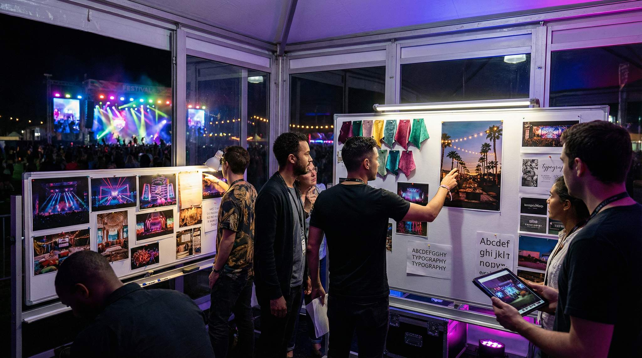
Creating an immersive festival vibe isn’t just about booking great acts – it’s about crafting a complete atmosphere that guests will remember. From the colours of the stage lights to the typography on signage, every detail contributes to the festival’s identity. But how do you ensure every element stays on-theme, especially when coordinating across teams, vendors, and talent? The answer: start by pre-visualising the vibe with moodboards.
Experienced festival producers across the globe – from intimate boutique gatherings in New Zealand to massive multi-stage spectacles in the UK – use moodboards as a secret weapon. A moodboard is a visual collage of references (images, colours, textures, fonts, and more) that represent the intended look and feel of your event. By assembling reference boards for lighting, colour palette, furniture and decor, and typography (among other elements), you create a shared visual language that aligns everyone involved. These boards are more than pretty pictures; they become a blueprint for decision-making and a contract everyone understands about the festival’s desired vibe.
In this guide, the art of pre-visualising your festival’s vibe through moodboards is explored in detail. Whether producing a small niche cultural festival or a large international music festival, having well-crafted moodboards will help avoid clichés, keep the creative vision on track, and ensure every decision – big or small – reinforces a cohesive atmosphere.
Why Moodboards Matter in Festival Production
Planning a festival involves multiple stakeholders – production designers, lighting technicians, stage builders, décor teams, food vendors, sponsors, and performing artists – each with their own perspective. Without a unifying reference, vision drift can occur: the decor team might envision a rustic bohemian setting while marketing designs a slick futuristic theme. Moodboards prevent such misalignment by providing a concrete visual reference for all.
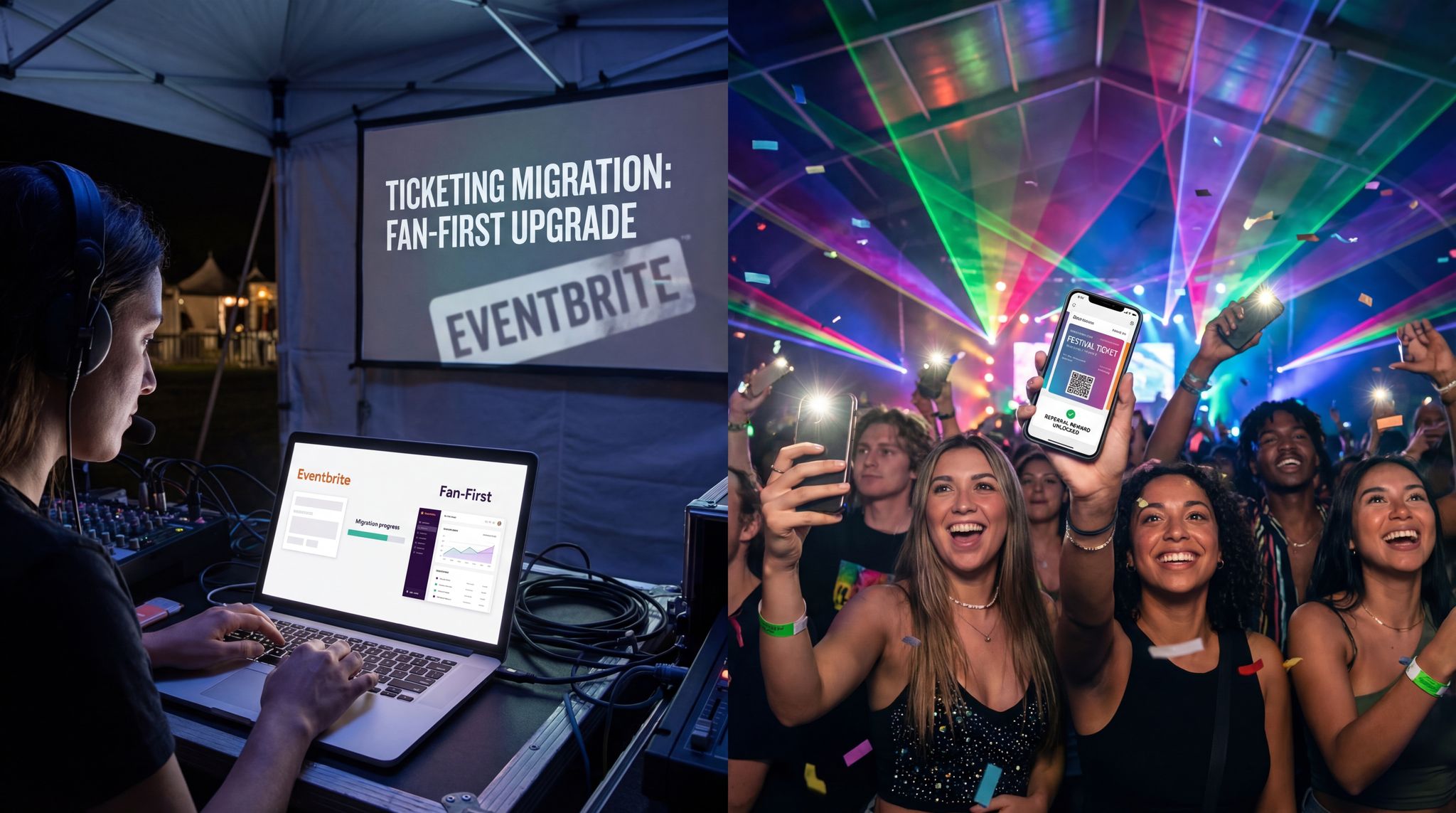
Grow Your Social Following With Every Sale
Require social media follows, shares, or playlist adds to unlock presale access or special pricing. Turn every ticket purchase into audience growth.
Whether you are conceptualising a corporate retreat or a large-scale public gathering, an event design mood board acts as your aesthetic anchor. For promoters specifically, a dedicated music festival mood board goes beyond basic decor to encompass stage architecture, VIP hospitality zones, and dynamic lighting rigs. It ensures that every visual touchpoint reinforces the overarching theme for the music festival, keeping both internal staff and external contractors perfectly aligned.
Effective event pre visualisation goes beyond simply picking colors; it serves as a critical risk-management tool for promoters and technical directors. By establishing a clear visual baseline early in the planning cycle, production teams can accurately forecast rigging requirements, spatial flow, and scenic fabrication costs before a single piece of material is ordered.
Planning a Festival?
Ticket Fairy's festival ticketing platform handles multi-day passes, RFID wristbands, and complex festival operations.
Key reasons festival organisers rely on moodboards:
– Communication of Vision: Describing a “whimsical tropical night market vibe” in words can lead to misinterpretation. A moodboard showing specific examples of what “whimsical tropical” looks like (e.g. string lights in palm trees, colourful tribal patterns, bamboo furniture) communicates the idea instantly and precisely.
– Aligning Teams: When everyone – from stage designers to social media managers – works from the same visual references, it ensures consistency. The lighting director in Singapore, the set builder in Mexico, and the graphic designer in London can all see the intended style and adjust their work accordingly.
– Sparking Creativity (Within Boundaries): Ironically, constraints can boost creativity. Moodboards set creative boundaries, saying “this is our style” (and implicitly, this is not). Within those boundaries, team members can innovate confidently. For example, knowing the festival’s palette is jewel-toned and nature-inspired guides a lighting designer to choose emerald and sapphire hues for evening shows, rather than random colours.
– Faster Approvals: A clear moodboard can help get buy-in from decision makers and even outside stakeholders. City officials, venue owners, or sponsors often need to know what they’re supporting. Showing them a moodboard of a tasteful, well-planned festival aesthetic – rather than trying to describe it abstractly – can secure permits or sponsorships more easily.
– Avoiding Costly Mistakes: It’s better to realise early that an idea doesn’t fit the vibe. Moodboards allow early iteration. If a proposed stage design or piece of furniture looks out of place on the board, it’s a red flag before money is spent. For instance, if your board for a boutique art-folk festival in Italy emphasises earthy tones and vintage decor, seeing a concept for a neon plastic stage facade on that board will immediately signal a mismatch. The team can then eliminate or adapt that element long before it’s built.
Building a Festival Moodboard: Key Elements
A festival moodboard isn’t just a random collage – it’s a carefully curated set of visuals addressing different aspects of the experience. Here are the core elements to consider including in your moodboards:
When assembling a comprehensive festival mood board, operators should segment their visual data. Breaking down the aesthetic into distinct operational categories allows specialized teams—like AV technicians or hospitality managers—to extract exactly what they need without getting lost in the broader event design.
Before diving into specific categories, remember that a successful event design mood board must serve as a practical tool, not just an artistic collage. When establishing the core theme for a music festival, promoters should ensure their boards include actionable references that production managers can actually source or build. Whether organizing a local indie showcase or a massive international gathering (where European production partners might request a moodboard événement), grounding your visual ideas in operational reality ensures the aesthetic translates seamlessly from screen to stage.
Boost Revenue With Smart Upsells
Sell merchandise, VIP upgrades, parking passes, and add-ons during checkout and via post-purchase emails. Increase average order value by up to 220%.
When locking down a specific theme for a music festival, the moodboard acts as the ultimate filter for your creative brainstorming. Whether you are leaning toward an industrial techno warehouse aesthetic or a sun-drenched indie-folk retreat, every visual added to your music festival mood board must justify its place. Promoters often start with a broad concept and use these boards to narrow down the visual identity, ensuring the final event design mood board is tight, focused, and ready for production teams to execute.
1. Colour Palette
Colours set the emotional tone of a festival. Decide on a core colour palette early – typically a set of primary and secondary colours that will appear in branding, decoration, and lighting. Are you going for the lush greens and earthy browns of a forest setting, or the bright neons of a futuristic rave? A well-defined palette ensures that everything from stage graphics to staff t-shirts aligns visually.
Need Festival Funding?
Get the capital you need to book headliners, secure venues, and scale your festival production.
Tips for palette moodboards:
– Include swatches or images that show the exact hues. For example, a sunset orange, turquoise blue, and sandy beige palette might suit a beach festival. Show those colours in context (e.g. a photo of beach sunset over tents) on the board.
– Aim for 5-8 key colours (with neutrals if needed) that complement each other and fit the theme. Too many colours can make the vibe chaotic; too few might be too rigid.
– Note what not to use as well: if your festival vibe is pastel and dreamy, you might include a “never” swatch of an aggressive red or black to signal it doesn’t fit the mood.
– Consider how colours will appear in different environments – daytime versus night, on LED screens or banners, under coloured lights. A deep purple might look great on a poster but nearly black on a poorly lit stage banner. Make sure the palette is workable for your specific venues and lighting.
2. Typography and Graphics
The fonts and graphic style used on all festival materials (from logos and signs to schedules and social media posts) hugely influence the vibe. A typography moodboard collects examples of typefaces, lettering styles, and graphic motifs that match your festival’s personality.
Tips for typography boards:
– Choose font styles that reflect the theme: e.g. elegant serif fonts and ornate decorative letters for a vintage jazz festival, or bold sans-serif fonts with edgy geometric patterns for a cutting-edge electronic festival.
– Include examples of logos, poster designs, or signage you admire that could serve as inspiration. If your festival is in a place like Mexico or India and embraces local culture, you might showcase lettering inspired by traditional art from those regions.
– Graphic motifs or illustration styles belong here too. For instance, a food festival might use hand-drawn produce illustrations, whereas a comic-con style festival might feature pop-art comic book graphics. Put snippets of these styles on the board.
– Don’t forget a “never” list here as well: if you’re avoiding overused designs, show what to steer clear of. A rock festival might say no to the generic grunge font everyone uses, or a family-friendly festival might ban scary or adult-themed imagery in graphics.
– Ensure readability. It’s easy to get carried away with a fancy typeface, but your moodboard should also remind the team that festival text (maps, directional signs, schedules) must be clear at a distance. If using artistic fonts, balance them with a clean font for practical info.
3. Lighting Inspiration
Lighting can dramatically transform a space and dictate whether the atmosphere feels intimate, thrilling, calming, or energetic. A lighting moodboard conveys how different areas of the festival should be lit and coloured.
Tips for lighting boards:
– Gather photos of stages, tents, or open areas lit in the style you want. For example, for a cozy boutique festival in a forest (like Canada’s Enchanted Forest gatherings), you might show warm amber string lights hanging from trees and soft washes of colour on the canopy. For a high-energy night stage at a dance festival, include shots of dynamic lasers or neon glow.
– Show colour transitions and intensity. Perhaps the moodboard illustrates that afternoons are in natural daylight with subtle accent lighting, while nights explode into saturated purples and blues. Or maybe the plan is to maintain a soft glow throughout for an ambient vibe.
– Highlight key lighting fixtures or techniques: like examples of projection mapping on buildings or stages (if that’s planned), moving head spotlights for dramatic moments, or festoon lights over a food court for a market feel.
– Indicate different zones: It’s useful to break out references for various areas – e.g., entrance lighting (welcoming and not too harsh), main stage (bold and captivating), chill-out area (gentle and low-key). This helps lighting designers allocate gear and styles appropriately.
– Use the “never” concept here too: if there are lighting effects that would ruin the vibe, call them out. For instance, a Renaissance-themed fair might say no strobe lights or LED screens, keeping tech-looking effects off the traditionally styled mood. A trance music festival might decide against white floodlights that break the neon illusion.
– Mind practicalities: if your venue is a farm field in Australia with no tall rigging points, your lighting moodboard should favour ground-based lighting towers or creative low-height solutions – not images of massive arena rigs that aren’t feasible. Moodboards must inspire within realistic constraints of your location and budget.
4. Furniture, Decor and Materials
This is the physical environment – from the style of stage structures and tents to the seating, tables, art installations, and even fencing. A furniture and décor moodboard sets expectations for what the festival grounds will look and feel like on a material level.
Tips for furniture & décor boards:
– Reference the style of major structures: If the main stage should look like a steampunk airship, include illustrations or photos of steampunk design elements. If tents and vendor booths are to have a Moroccan bazaar vibe, show examples of canopies, lanterns, and textiles with that flavour.
– Include furniture types for lounges or VIP areas: e.g., vintage sofas and persian rugs for a boho lounge, or sleek LED-lit furniture for a futuristic VIP area. Even general admission areas might have seating or shade structures – pictures of colourful festival flags, tipi tents, or hay bales (if going for a farm feel) help guide choices.
– Show material and texture references: Moodboards can specify material preferences – perhaps reclaimed wood and natural fabrics for an eco-friendly festival (no shiny plastics), or glossy black metal and glass for an industrial-chic event. These details trickle down to vendors: a food stall might swap a plastic tablecloth for a burlap cover if they know the event aesthetic values organic textures.
– Signage and wayfinding décor: This overlaps with typography but focuses on physical signs and decorations. Include examples of how you envision signposts, stage name boards, banners, and even small touches like stage backdrops or archways. For example, a festival in a historic European town might use old-style wooden signposts, whereas an anime pop-culture festival in Singapore might use bright digital signs in an 8-bit game style.
– The “never” list here can be a literal list of banned décor elements. If you never want cheap inflatable tube-men near your stages or absolutely no standard trade-show booths on your grounds, make it clear by showing one crossed out. Some festivals even circulate a short “Do Not Use” deck to vendors, featuring cliché decor to avoid – such as generic red-and-white festival bunting or folding banquet chairs – alongside the approved moodboard style.
– Local cultural relevance: Especially for festivals in culturally rich locations (think a folk festival in India or a heritage food festival in Mexico), use the moodboard to remind everyone of appropriate cultural elements. That might mean including images of local art or traditional patterns that can be incorporated, and conversely excluding anything that would feel culturally out of place or insensitive.
5. Additional Visual Elements
Depending on the type of festival, you may need other categories of moodboards or slides:
– Fashion & Costume: If staff uniforms or performers’ attire should follow the vibe (common in themed festivals or stage shows), provide costume inspiration. A 1960s retro festival, for example, might share moodboard images of go-go boots and mod dresses with booked performers so they can join the fun visually.
– Stage and Set Design: Go deeper into stage aesthetics by providing sketches or reference photos for stage designers. Even if they’ll create something unique, the board can show the level of detail or style expected (e.g., “We love the whimsical handmade look of these smaller stages at Glastonbury” or “This case study of a stage with integrated LED art at Ultra Festival is our benchmark”).
– Art Installations & Interactive Elements: Many festivals, especially boutique ones, feature art pieces or interactive zones (think burning man-style sculptures or creative photo booths). Include references for these so the art team or external artists know what aligns. Is it avant-garde modern art or folksy and charming? High-tech VR or low-tech collaborative paintings? The board should answer that.
– Venue Layout & Signage Style: If your festival site has unique layout needs, a few moodboard images of site maps or decor placement can help. For instance, showing how an entrance gate is decorated, or examples of cosy corners and pathways from other festivals, can illustrate the intended use of space. This might also include referencing lighting in context of layout (combining elements of boards above).
– Digital & Marketing Collateral: Although production-focused, the vibe carries into marketing. Having a mini-board for social media post style, website design elements, and merchandise look can ensure the promotional materials match the on-site experience. This way, the audience’s first impression online already starts immersing them in the mood.
When mapping out these physical spaces, advanced event pre visualisation often borrows spatial flow concepts from other disciplines. For example, applying level design principles to guide crowd movement naturally through complex multi-stage environments or Moroccan-inspired VIP zones ensures that the aesthetic vision also supports operational safety and crowd control.
Drawing level design lessons from gaming allows site operations managers to treat the festival grounds like an interactive map. By using distinct lighting shifts or thematic decor changes—as outlined in your festival mood board—you can subtly direct foot traffic, reduce bottlenecks, and highlight key revenue-generating attractions without relying solely on traditional signage.
Remember, you don’t need a separate physical board for each category – many festival producers create a comprehensive presentation (slide deck or large board) with sections, or a collection of boards, each addressing one theme (colours, lighting, etc.). The goal is to cover all sensory and visual aspects so nothing is left to guesswork by team members.
Sharing and Using Moodboards Across Your Team
A moodboard is only effective if it’s actually used. The best festival producers make moodboards a living part of the production process, sharing them widely and referring back to them whenever decisions arise. Here’s how moodboards come into play with different stakeholders:
- Internal Production Team: From the creative director to the site operations manager, everyone internally should be familiar with the moodboard. Kick off planning meetings by reviewing it, and print copies for the war-room wall if you have an on-site office. For example, a boutique festival in Indonesia might have the team’s office plastered with images of Balinese art, tropical foliage, and vibrant textiles from the moodboard to constantly reinforce the intended tropical artsy vibe.
- Designers and Contractors: Share relevant parts of the moodboard with every designer and contractor you hire – stage builders, lighting designers, sound and AV teams (for any visual content on screens), set dressers, tent suppliers, and beyond. If you bring on a décor vendor for your VIP area, showing them the board is far more effective than a written brief saying “make it chic and comfortable.” The references will tell them if “chic” means minimalist white lounge or bohemian Moroccan lounge.
- Vendors (Food, Crafts & Merchants): Independent vendors often come with their own booth setup and branding. Encouraging them to align with your festival look can be tricky, but moodboards help. Well before the event, send out a vendor guide that includes a page or two of moodboard images and guidelines: e.g., “Our festival’s vibe is a vintage county fair – think mason jar lamps, wooden signage, and hay bale seating. Here are examples. Please no LED menus or plastic decor.” By giving visual examples, vendors are more likely to tweak their stall presentation to blend in, enhancing the overall attendee experience. Some major festivals (such as those in the UK and Europe) even offer booth decoration kits aligned to their theme – an idea drawn directly from moodboard planning.
- Artists and Talent: Performers also benefit from understanding the vibe. While you won’t dictate an artist’s personal style, you can share the moodboard to inspire them. Many festival artists appreciate knowing the atmosphere to expect – a comedian or poet might tailor their set backdrop to match a cosy cabaret tent vibe, a band might coordinate their outfits or visuals with the colour scheme rather than clashing. For instance, if you’re running an 80s-themed festival, letting the bands know the overall colour scheme is neon retro and the stage will be decked out in vintage arcade visuals gives them a chance to join the fun (maybe they’ll dress in 80s attire or adjust their lighting). The result is a more immersive and Instagrammable experience for attendees, where even candid shots of performers still look on-theme.
- Stakeholders and Sponsors: While moodboards are primarily a creative tool, don’t underestimate their power to convey professionalism and vision to sponsors or partners. Showing that you have a clear aesthetic plan can impress sponsors – it promises a well-produced event with attention to detail (which means their brand will be showcased in a thoughtful environment). You might include a modified moodboard slide that demonstrates how sponsor logos or activations will be integrated without breaking the vibe. For example, a tech sponsor’s booth at a folk festival might be asked to use a wooden facade or earthy colour scheme, as shown on the board, instead of a shiny metal expo stand. This prepares sponsors for creative requests and ensures their presence enhances rather than detracts from the festival atmosphere.
Tip: Make the moodboard easily accessible – use cloud sharing or project management tools to ensure everyone can refer to the latest version. And encourage team members to literally carry it with them; a site manager might keep a small printout or have images on their phone to quickly check if a last-minute decision (like “what colour should these directional flags be?”) aligns with the agreed vibe.
“Never” Slides: Guiding by Showing What Not to Do
One of the most powerful additions to a festival moodboard deck is the “never list” or “anti-inspiration” slide. These are visuals that illustrate what you don’t want, serving as gentle warnings against creative drift and clichés. It might feel negative to include, but clear boundaries help everyone stay true to the vision.
What might a “never” slide contain? Essentially, examples of colours, decor, or styles that are off-limits for your event:
– Overused clichés: Every region and genre has its tired tropes. If you’re curating a cutting-edge art and music festival, you might ban the stereotypical giant mirror-ball or generic rave graphics. If it’s a high-end food festival, you might say no to the red-and-white checked tablecloths and chalkboard menus that every casual food event seems to use.
– Clashing elements: Some ideas are great on their own but clash with your particular theme. A Renaissance faire-style festival would ban modern digital-looking fonts on signs – so your “never” board might show an example of modern signage that’s wrong next to the old-timey style you do want. At a beach festival in Spain with a chill Balearic vibe, you might exclude heavy metal-style skull artwork or anything too gothic that doesn’t mesh with sunshine and palm trees.
– Sponsor and marketing no-nos: It’s also wise to visually depict what sponsors or marketers shouldn’t do. For instance, show a mock-up of a sponsor logo the wrong way – clashing colours or enormous banners – with a red X over it, next to an example of a well-integrated, tastefully sized sponsor logo placement (perhaps on natural fabric signage, in muted colours). This “never” inclusion is invaluable for your sponsorship team as they negotiate how brands will appear on-site.
– Quality and safety pitfalls: Sometimes a “never” image is about quality control or safety. For example, if you’re organising a festival in India during monsoon season, you might include a photo of a flooded, failed infrastructure with a note “Never: open wire lighting in rain – all decor must be weatherproof.” Or a “never” could be flimsy pop-up tents if you’ve decided to invest in sturdier structures for a premium feel.
– Case study – avoiding drift: A real-world example comes from a boutique music festival in California that had a cohesive enchanted forest theme. In their early years, they noticed vendors bringing in bright branded canopy tents that ruined the look. The solution was adding a “never” slide to their moodboard deck, explicitly showing a standard logo-splashed EZ-Up tent as a “do not” image, alongside photos of decorated tents and natural-coloured canopies as the preferred style. By sharing this with vendors well in advance, the next edition of the festival saw vendors either cover their tents in fabrics and greenery or use event-provided thematic tents – transforming the visual coherence of the grounds.
Using “never” slides should be done diplomatically. The aim isn’t to shame anyone’s ideas, but to provide concrete examples of what to avoid. Many professionals actually appreciate this clarity – it’s one less thing to guess about. By eliminating the obvious wrong turns, you free your team to focus on inventive solutions that fit the festival.
Updating Moodboards as Constraints and Solutions Emerge
A moodboard is a living document, not a static decree from day one. Festivals are complex projects, and as planning progresses, you’ll encounter constraints (budget limitations, venue rules, technical hurdles) along with new creative solutions. It’s crucial to update your moodboards to reflect these realities, so the visual guide stays accurate and useful.
Why update? Imagine your initial moodboard envisioned hundreds of hanging lanterns over the audience area for a magical effect. Later, you discover the venue’s rigging points are limited or wind at the location makes hanging décor unsafe. If you don’t update the moodboard, half your team might still be expecting those lanterns. By revising the board (perhaps swapping in images of a ground-based LED installation or safer festoon lighting on poles), you ensure the vision adapts and everyone adjusts expectations together.
Good practices for evolving your moodboard:
– Version control: Label updates with dates or version numbers (e.g., FestivalVibeBoard_v2_Jan2025). Share the updated boards widely, highlighting what changed. “We’ve updated the décor section: open flames are out (fire marshal’s orders), LED candles in. See new references on slide 5.”
– Incorporate solutions, not just cuts: If a constraint forces removal of an element, try to replace it with an alternative on the board. This turns a problem into an opportunity for creativity. If budget cuts mean you can’t have the extravagant floral sculptures you showed initially, replace those images with photos of simpler but still charming decor (maybe DIY flower garlands or painted backdrops). The mood remains consistent, and team members don’t feel demoralised by loss – they see a fresh solution to pursue.
– Keep core themes consistent: When updating, maintain the core colour palette and thematic elements unless a fundamental rebranding occurs. Tweaks should feel like part of the same story. If your theme is “Space Carnival” and you drop one type of LED planet decoration due to cost, the replacement should still say “space carnival” – maybe you add more star lanterns instead of planet orbs. The moodboard’s job is to evolve while preserving the soul of the concept.
– Document decisions: Use captions or notes on the moodboard if needed to explain changes. For example, tag an image with “Revised: Using fabric streamers instead of fireworks for finale – noise restrictions in city” so that months later, anyone reviewing remembers why that choice was made. It prevents backsliding, like someone re-adding fireworks plans not realising they were ruled out.
– Engage the team: If you’ve fostered a collaborative culture, team members might contribute to updating the moodboard. A lighting engineer in New Zealand might find a new type of eco-friendly light that fits your vibe and share it to include. Encouraging this keeps the board dynamic and owned by everyone, not just the creative director. Just ensure one person or a small team curates these contributions so the board doesn’t become unfocused.
By showtime, your moodboard (and its successive iterations) will have guided hundreds of micro-decisions. When you walk the festival site just before gates open, the world around you should look eerily similar to those boards you crafted months ago. That consistency is a sign of thorough planning and adaptation – the pre-visualised vibe has become reality.
Moodboards as a Shared Visual Contract
Think of a moodboard as a visual contract. While it’s not a legal document, it sets an informal agreement among everyone involved about what the festival’s creative direction will be. It’s a contract in the sense that it establishes accountability: once the moodboard is agreed upon, every contributor is expected to honour it in their work.
How this “contract” plays out:
– During planning, when an idea is suggested, the team can ask: “Is it on-moodboard?” This simple question acts as a litmus test. If someone proposes adding, say, a neon-painted sculpture in the middle of a historically themed festival, the moodboard contract gently pulls them back – does it align with our agreed visuals? If no, it’s either dropped or radically altered. The board isn’t there to stifle creativity, but to channel it so the end result remains coherent.
– Newcomers or last-minute hires can get up to speed in a flash. Hand them the moodboard and in a few minutes they grasp the vibe contract you’ve all signed. It’s a faster onboarding than lengthy meetings. A production crew member joining late in Canada for a touring festival, for example, can look at moodboards from the earlier stops and immediately see the style – perhaps saving them from painting something the wrong colour or using an incorrect material on a repair.
– It simplifies decision conflicts. In the crunch time before the festival, if there’s a debate – say, the decor team wants to swap in a new banner design – referencing the moodboard can resolve it objectively. “Does this new banner match what we all agreed on visually? If it sticks out compared to everything on the board, let’s adjust it.” It moves discussions from subjective opinions (“I don’t like it”) to a common reference point (“It doesn’t fit our established look”).
– After the event, the moodboard even serves as a post-mortem tool. You can compare photos of the actual festival to the boards. Did the team execute the intended vibe? Any element that looked off in reality stands out, and you can learn if maybe the moodboard was unclear or if someone went rogue. This reflection helps improve future planning (perhaps you realise you needed a stricter “never” section, or more detailed references for a particular area).
In essence, treating the moodboard as a contract fosters a sense of collective responsibility for the festival’s look and feel. It’s not just the creative director’s job to guard the vibe – everyone from the volunteers hanging decorations to the lighting operator programming the light show shares that responsibility, guided by the visual contract.
Conclusion
Building a festival is a labour of love that merges artistry and logistics. By pre-visualising the vibe through comprehensive moodboards, festival producers can bridge the gap between a grand creative vision and on-the-ground execution. A moodboard translates abstract ideas into a tangible visual plan: it aligns diverse teams under one aesthetic banner, prevents costly missteps and off-brand choices, and nurtures the cohesive atmosphere that festival-goers notice – even if they can’t articulate why everything just feels right.
From the smallest boutique beach festival in Bali to the largest multi-stage music extravaganza in California, the principles remain the same. Invest time early in crafting moodboards that detail your lighting, palette, typography, decor, and more. Share them, enforce them (with positivity and clarity), and evolve them as needed. Your reward will be walking through a festival site that looks like the inside of your mind painted across reality – a satisfying payoff for all the coordination and creativity invested.
As you prepare your next festival production, gather your reference images and start piecing together that vision. Align your team with it, and watch as the moodboard becomes a backstage hero of your event, quietly ensuring every corner of the festival speaks the same language of vibe.
Frequently Asked Questions
What is a festival moodboard used for?
A festival moodboard is a visual collage of references—including images, colours, textures, and fonts—that represents the intended look and feel of an event. It serves as a shared visual language and blueprint for decision-making, ensuring every element from stage lighting to signage aligns with the festival’s identity.
Why are moodboards important in festival production?
Moodboards prevent vision drift by providing a concrete visual reference that aligns diverse stakeholders, from lighting technicians to food vendors. They facilitate faster approvals from sponsors, help avoid costly design mistakes by flagging mismatches early, and set creative boundaries that encourage innovation within a cohesive aesthetic.
What key elements go into a festival design moodboard?
A comprehensive festival moodboard should include a core colour palette of 5-8 hues, typography and graphic styles, lighting inspiration for different zones, and references for furniture, décor, and materials. It may also feature specific sections for stage design, fashion, art installations, and a “never” list to define what to avoid.
How does a “never list” improve festival aesthetics?
A “never list” or anti-inspiration slide is a visual collection of elements that are off-limits for the event, such as overused clichés, clashing fonts, or specific materials like plastic. This tool prevents creative drift by clearly showing vendors and teams exactly what styles or items to avoid to maintain the festival’s vibe.
How do moodboards assist festival vendors and artists?
Sharing moodboards with vendors and artists ensures their contributions align with the festival’s atmosphere. For vendors, it guides booth decoration choices, such as using specific materials or avoiding plastic signage. For artists, it inspires performance visuals or costumes that coordinate with the event’s colour scheme and overall aesthetic.
When should a production team update their moodboards?
Festival moodboards must function as living documents that evolve when constraints like budget limitations or venue rules arise. Updating the board to reflect new solutions—such as swapping rigging for ground-based lighting—ensures the visual guide remains accurate and keeps the entire team aligned on the achievable vision.
How does an event design mood board differ from a standard inspiration board?
While a standard inspiration board might just collect appealing images, an event design mood board is a strategic B2B tool used by producers and promoters. It dictates specific operational choices—from structural materials and stage lighting to vendor booth aesthetics—ensuring the overarching theme for a music festival or live event is executed consistently across all departments.
How do you translate a broad theme for a music festival into a practical moodboard?
Translating a high-level concept into a functional event design mood board requires breaking the overarching aesthetic down into actionable operational categories. Instead of just pinning inspirational artwork, a practical festival mood board should include specific material references, achievable lighting rigs, and realistic structural designs. This ensures that the chosen theme can be executed within budget and venue constraints by your production teams and external vendors.
What role does event pre visualisation play in festival production?
Event pre visualisation is the strategic process of mapping out the aesthetic, spatial, and technical elements of a live experience before physical production begins. For festival organizers, this practice—often anchored by comprehensive moodboards and 3D renders—minimizes costly on-site revisions, aligns external vendors with the core theme, and ensures that the final build accurately reflects the initial creative vision.
How do you choose a cohesive theme for a music festival using a moodboard?
Selecting a theme for a music festival starts with gathering broad visual inspiration that aligns with your target demographic and musical genres. By compiling these initial ideas into a preliminary music festival mood board, promoters can identify recurring visual patterns—such as specific color palettes or architectural styles. This process helps refine a vague concept into a concrete event design mood board that production teams can use to build a unified, immersive environment.